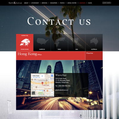
HeavyLight redesigned the branding for financial organisation Sett&Lucas, and created a new promotional video and website under that brand.
They wanted to keep the essence of their original logo, as it had been in place for a long time, but they were aware of the need for an update to the logo and the company’s brand overall. We worked with the existing elements, chose an new, more streamlined serif font and made the ampersand into a feature, separating out a serif from it and turning it into an arrow, which then became the unifying branding element, used throughout the video and the website.
This brand is also reflected in the work HeavyLight have done on Zurik – a financial regulation tracking product, backed by Sett & Lucas.