
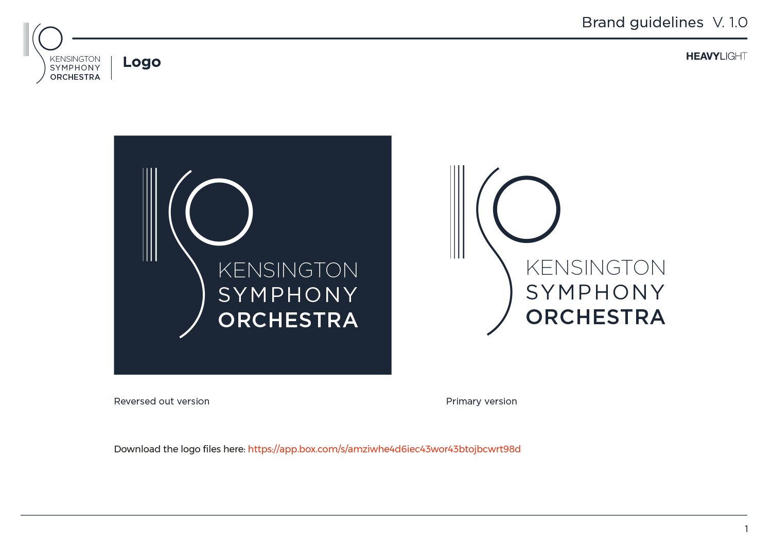
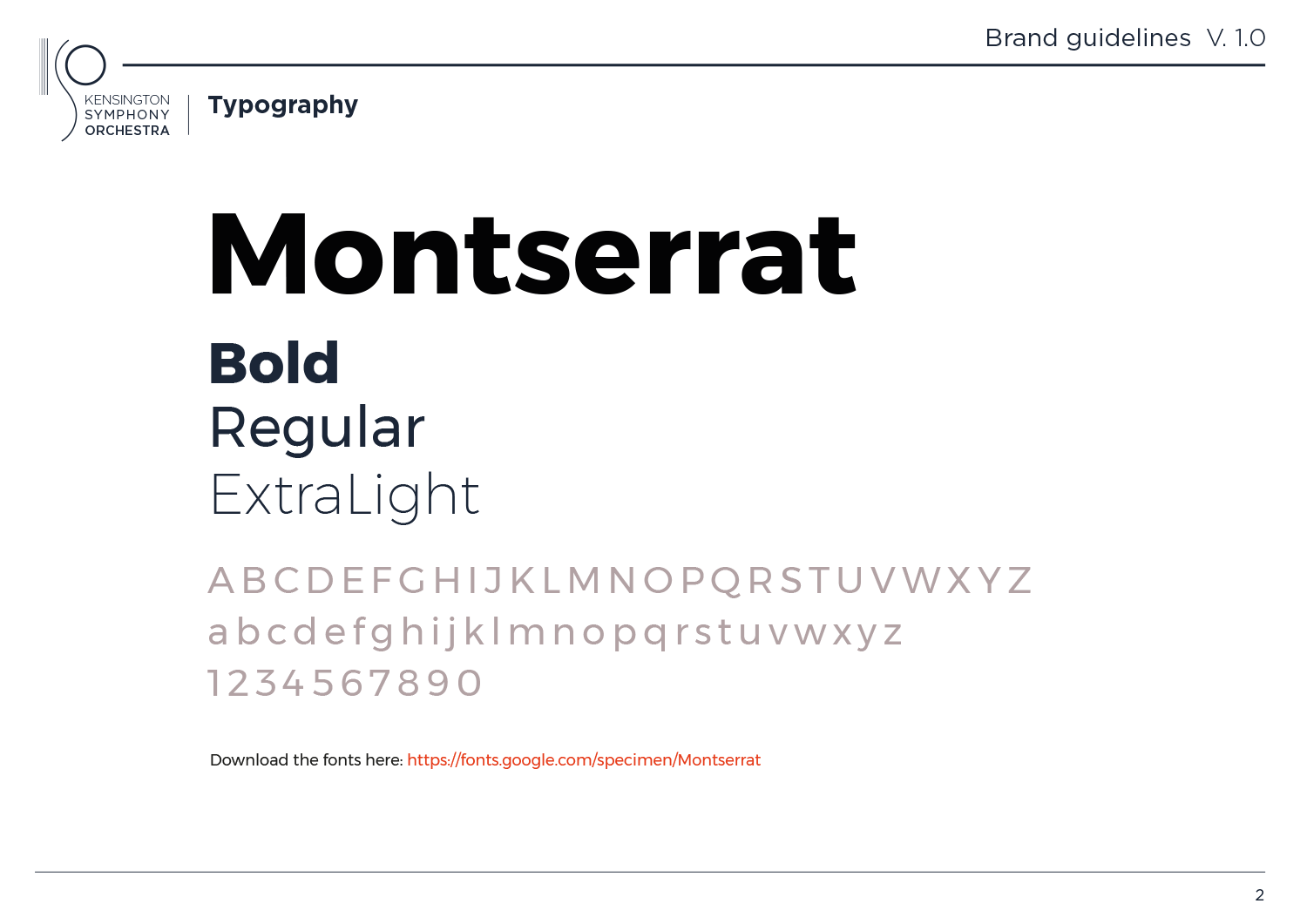
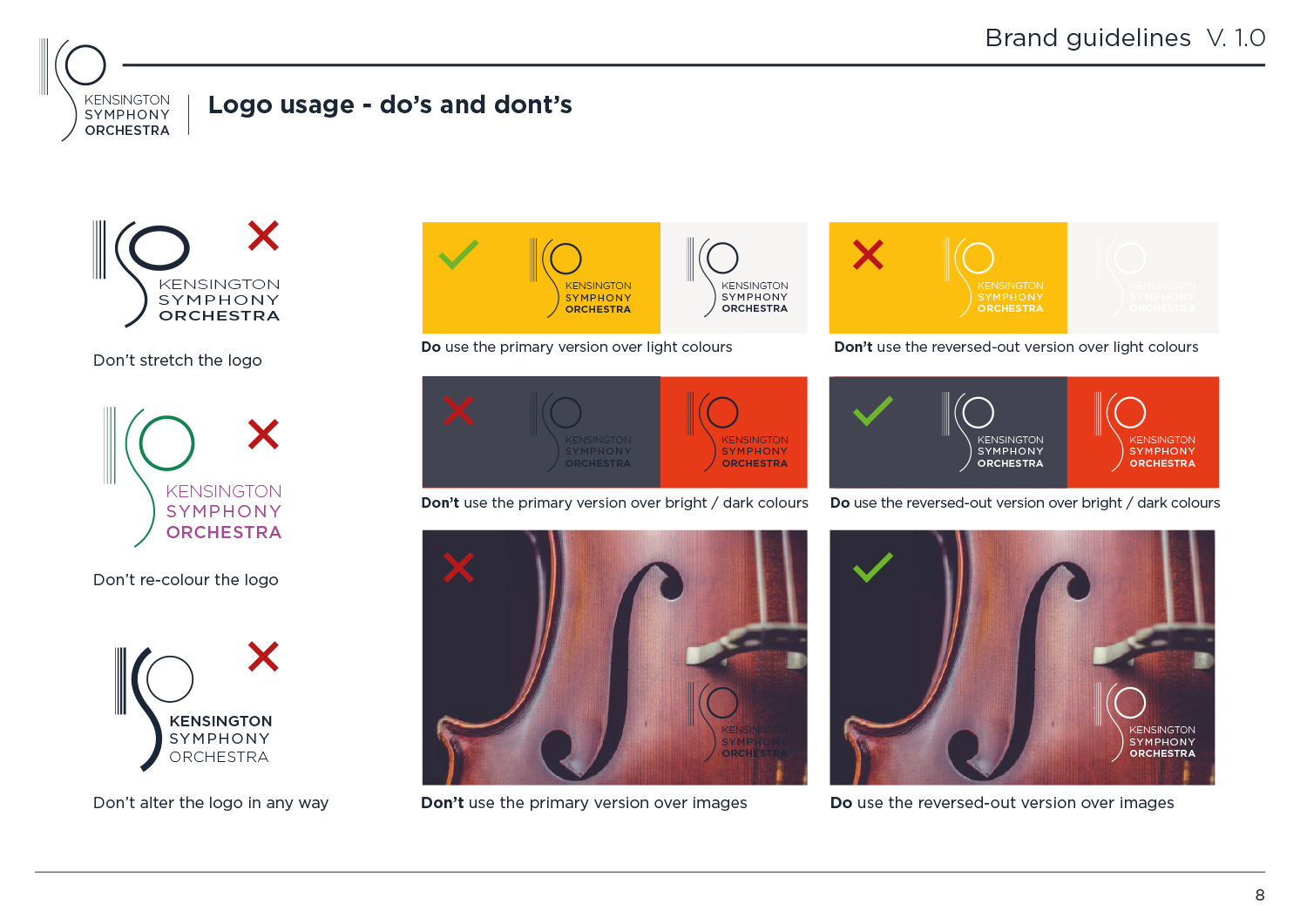
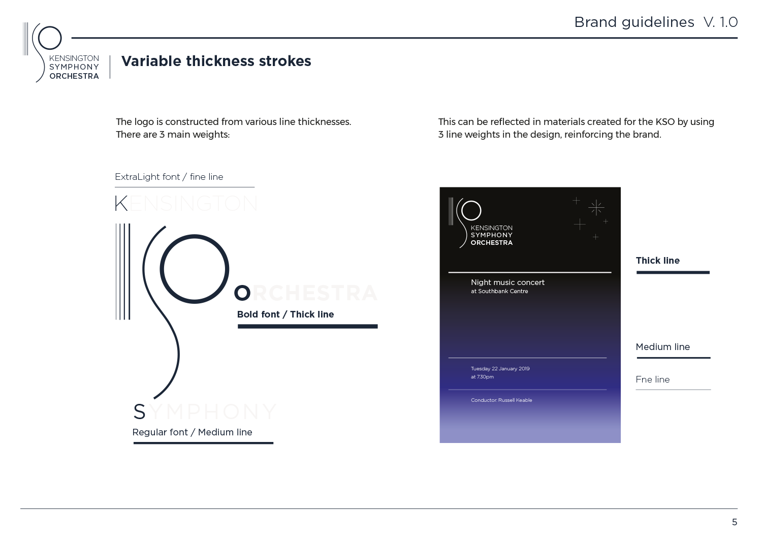
We were asked by out friends at the Kensington Symphony Orchestra to redesign their branding, which had been in place for some time and was looking somewhat outdated. We designed a new logo based on shapes found in the design of musical instruments, with a modernist and slightly art deco feel. Gotham was selected as an updated take on modern classic Futura and the font weights were matched to the logo element line weights, to relate the initial letters / symbols to their relevant words.
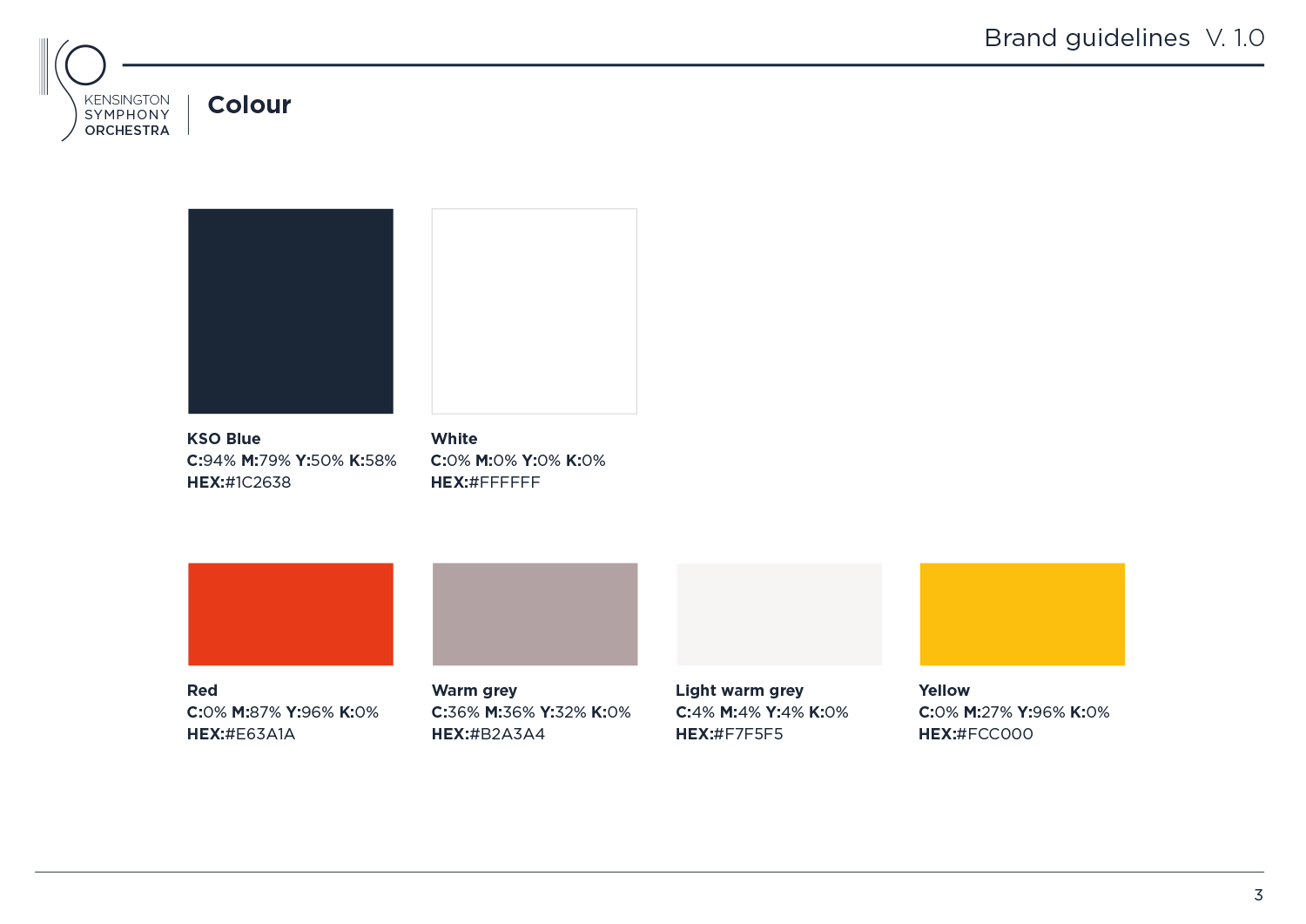
We then created a set of brand guidelines including fonts, colours, design elements and guidance, to reinforce the brand look.
The new KSO logo
KSO brand guidelines
An experimental idea for turning the KSO logo in a physical sculpture