Following on from our rebrand of robotic automation company Droidal, the client asked us to design a new website with the new branding. We created 2 concept options and after some discussion we settled on one concept with some elements included from the second concept. The site is designed to appeal to those in the healthcare industry, and tries to reflect the precision and cleanliness that is valued in that world. We used elements from the logo throughout, combined with photography and a distinctive corporate font, selected for it’s subtly futuristic design.
In over 60 years of music-making, Kensington Symphony Orchestra has built an enviable reputation as one of the UK’s most accomplished and adventurous non-professional orchestras. The KSO felt the need to update their identity to reflect this history and reputation, and came to us to design it.
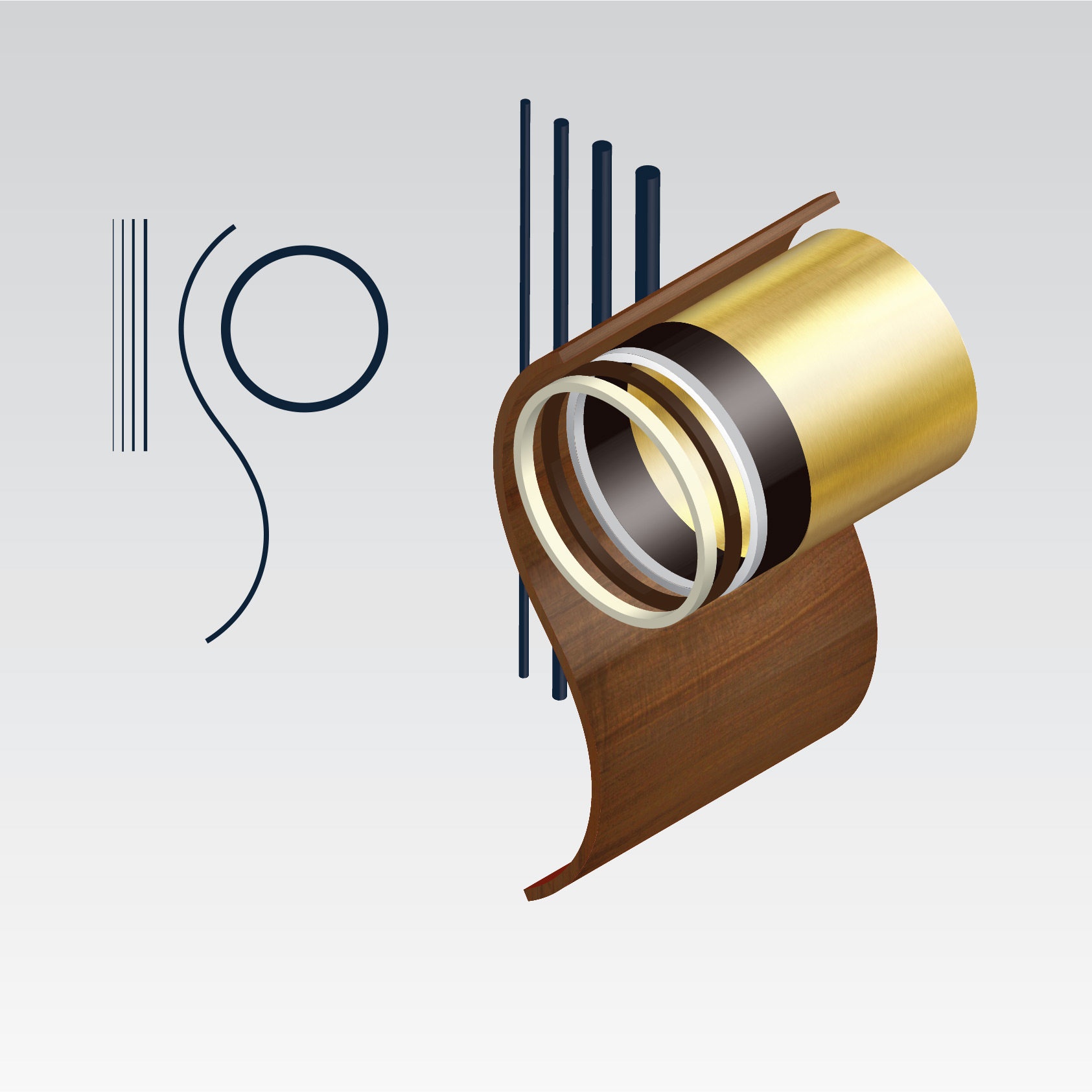
We’re currently working on a logo design that combines historical references with geometric shapes that reflect the beautiful instruments found in the orchestra.

Work-in-progress on the KSO identity

WorldRemit are a disruptive fintech company with a strong content marketing strategy in place. However, they were lacking a good way of showing and sharing their high-quality content with the world.
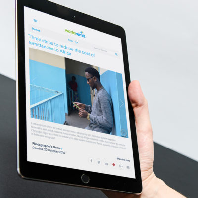
HeavyLight were hired to design a responsive content portal for them from scratch, based on the requirements of the content creators and the business. World Remit Stories now showcases their video, image and text content to it’s best advantage on all devices, with filtering by geography and subject. The project was developed in Umbraco, to allow for seamless integration into their existing Umbraco site.

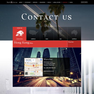
HeavyLight redesigned the branding for financial organisation Sett&Lucas, and created a new promotional video and website under that brand.
They wanted to keep the essence of their original logo, as it had been in place for a long time, but they were aware of the need for an update to the logo and the company’s brand overall. We worked with the existing elements, chose an new, more streamlined serif font and made the ampersand into a feature, separating out a serif from it and turning it into an arrow, which then became the unifying branding element, used throughout the video and the website.
This brand is also reflected in the work HeavyLight have done on Zurik – a financial regulation tracking product, backed by Sett & Lucas.