
Adaptive Medical Partners are a US-based company providing recruitment services to the Healthcare industry. They approached us to rebrand their new web-based recruitment platform, Metropolis. We worked from an initial logo to create a more refined brand, referencing Fritz Lang’s Metropolis and the related visual style of the 1920’s Art Deco. We created a brand styleguide and then moved on to redesign the website. Carrying the 20’s deco theme on throughout the design, we created custom iconography and illustrations, along with the use of symmetrical photography and classic geometric typography in the form of the Futura font family.
We also created a short motion graphic piece for the intro to the site, with an animated logo, and a dynamic continuation of the symmetrical photography theme.
The initial MVP website had some usability issues, especially around the two sides of the service – essentially Doctors and Hostpitals, being confused about where to sign up. To address this issue, we designed the homepage to be split vertically into two, with clear illustrations and calls to action for each user type.
The primary logo with tag-line
The logo reversed out
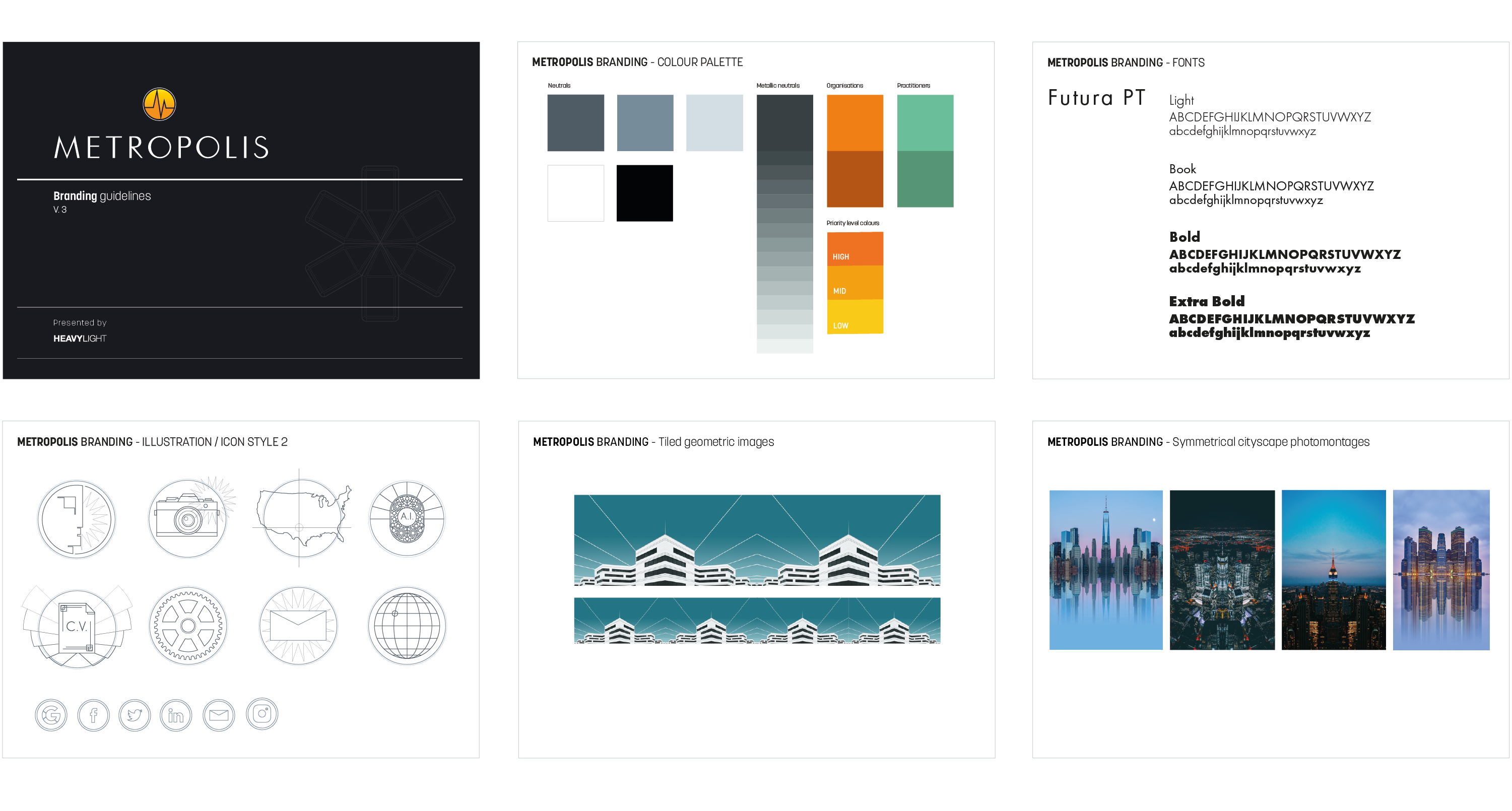
The Metropolis brand styleguide